
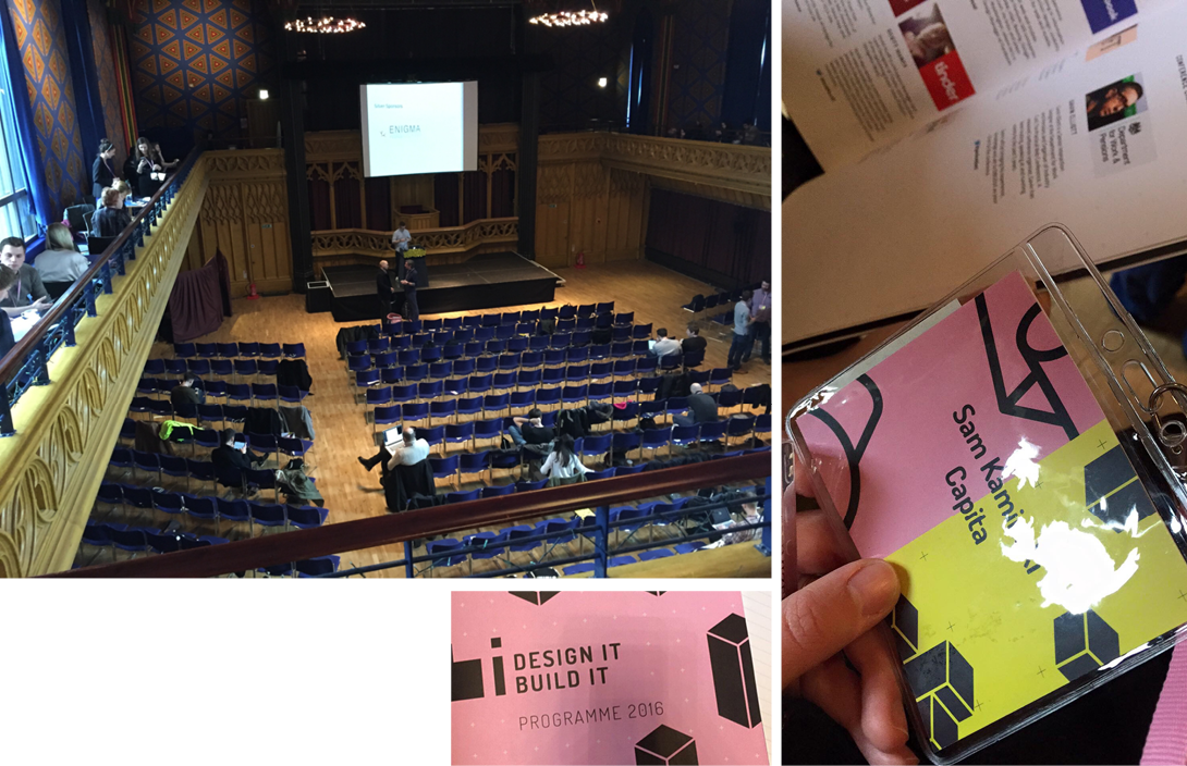
DIBI (Design It; Build It) is a two-day digital conference for designers & developers. This edition took place in Edinburgh 17th-18th March 2016. The first day was focused mainly around Design and design management, day two was more techy… but we’ll get to that later.
Day One started off with registration, tea, coffee and a generally get to know faces in the Hub – a converted church in the heart of Edinburgh. At 9.30 we were all sitting and attentively listening to the brief welcome to DIBI, sharing what to expect from the next two days by Jim Richardson, the Conference Organiser and Gavin Elliot, the Conference Chair.
Day 1
KEYNOTE

Cap Watkins, Buzzfeed
Design Everything
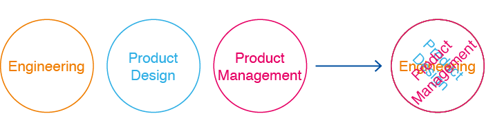
Cap Watkins – product designer living & working in Brooklyn, NY. Currently the VP of Design at BuzzFeed, as well as a blogger, podcast guest, conference speaker and lover of start-ups and technology. At Dibi he talked a lot about team management and how to incorporate design into every stage of the process. The main problem is convincing the organization that this is the way it should be. On his blog I found an interesting article with a nice diagram about how the process of producing something has changed. The article is called “ Management and Power” (link: http://blog.capwatkins.com/management-power) and talks about how most companies think this is the perfect management structure:
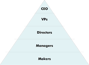
The problem new managers will face in such a company is that the artefact they’re responsible for has changed. As a design manager, they are no longer directly responsible for the design that gets done—that’s the responsibility of the designer. As an engineering manager they can’t be in charge of everything that gets done. There output should be the success of the people they manage. So the structure should look more like this:
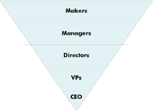
Management is about letting go of your old power and putting that into the hands of your team. It’s about enabling the people on your team and supporting them to do their very best work.
At Dibi the four key things Cap wanted us to understand about team management were:
- Design makes all the decisions. Try to be thoughtful of all the sectors. Engineering, Product Design and Product Development should all work together to create the best design and each should thing of the others while designing/producing something.
- Pretend you’re already there (lie). This is a very positive way of thinking and when recruiting someone new to the team it works better if the new team member thinks everyone has been using the team collaboration site or procedures for ages. Here are a few tools that they use in Buzzfeed:
- Basecamp – a web-based project-management tool developed by Basecamp and launched in 2004
- Solid – BuzzFeed’s CSS style guide. Influenced by frameworks like Basscss, Solid uses immutable, atomic CSS classes to rapidly prototype and develop features, providing consistent styling options along with the flexibility to create new layouts and designs without the need to write additional CSS. Additionally, a few globally-resuable HTML and CSS components are available to help new apps spin up quickly without having to reinvent the wheel each time (with more on the way). http://solid.buzzfeed.com/
- Treehouse – A website where you can learn from over 1000 videos created by expert teachers on web design, coding, business, and much more. The library is continually refreshed with the latest on web technology. The team at Buzzfeed do “rotational coding” which basically means everyone has to know how to code – even the designers. Cad thinks all designers should know how to code. I’m not sure whether ALL designers should. They definitely should know the basics so they know the boundaries coding has. The ones that want to know more should use every tool possible and managers should help them on their journey. Definitely get designs into code earlier. A modular approach let’s you make performance decisions before design sign-off
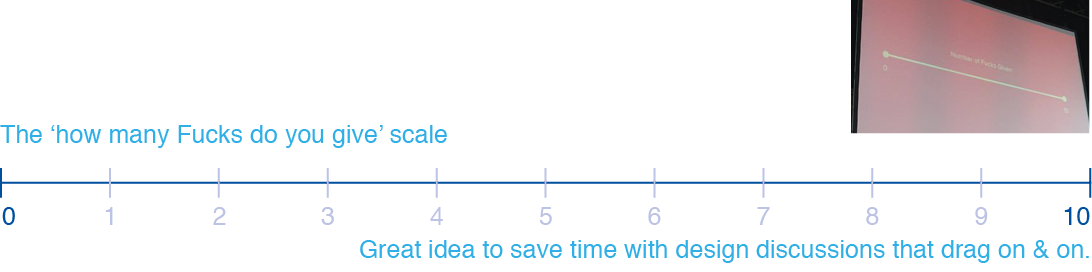
- Number of fucks given -> learn to rate your feelings. We hear it all the time but saying it in a collaborative way really sparked. When we’re talking/brainstorming with team members and you get into a dispute with someone it’s good to ask yourself how much your side of the argument is important to you. Try to scale it as a from 0-10 fucks given. If it’s a two and the other persons is at 8 – I think you can just let it pass.
- Be patient with you and your team. Draw out a timeline and fix goals. Everyone in the team should contribute. Managers must let team members grow. Designers want control and that’s why they learn things.
Another thing Cad talked about was how important mentors are. This is a topic that popped up a fair few times during the conference. Be annoying to mentors – bother them as much as possible and learn as much as you can. Become a mentor yourself. Help designers grow.
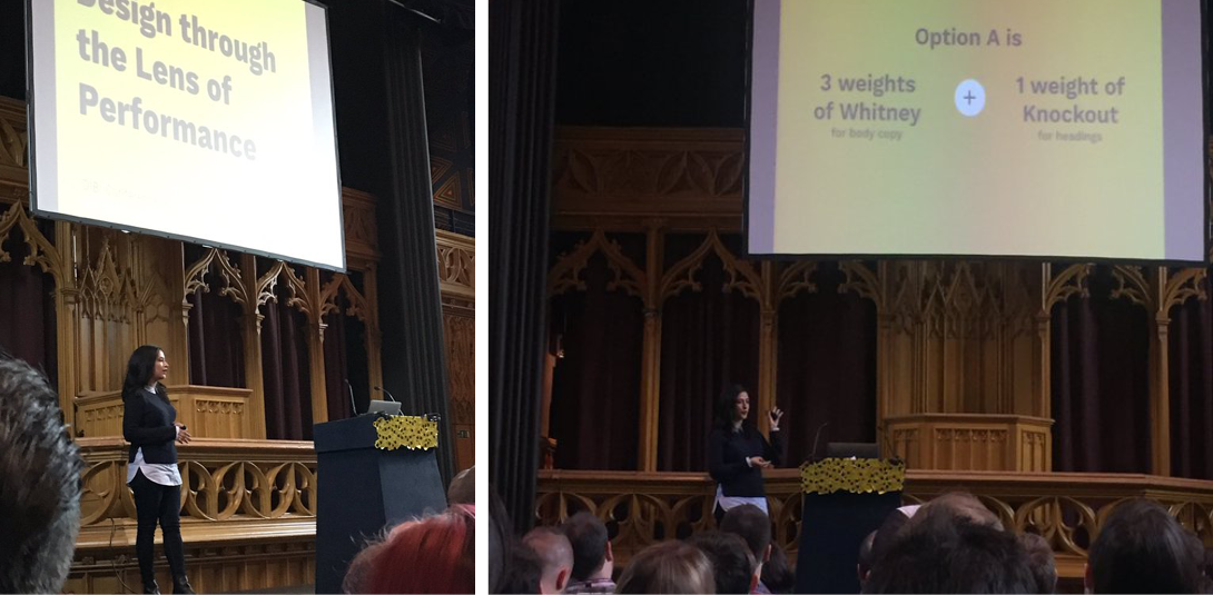
Yesenia Perez-Cruz, Vox
Design decisions through the lens of a performance budget
Yesenia gave a very interesting talk about the speed vs design problem each designer faces. While designing a website we should always take into account connectivity issues. Even a 100 millisecond delay in loading can negatively impact user experience.
We’ve been careless while designing the web. Web blockers have been created to block the content that most companies use to personalise themselves. We shouldn’t have to “fight back”.
Best overall UX is not about beauty vs. functionality
A good example is choosing a chair for work. We’d like to go with the cool Scandinavian design’y one, but we probably should go with the uglier, more comfortable one.

Fast sites build trust
Fast sites are memorable
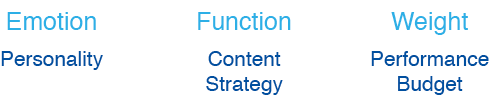
Design for performance:
- Design Deliberately (font/visuals/content)
- Set a performance budget (it’s a tangible way to talk to the client)
- Communication (Designer/IT/Programmers/Stakeholders)
Every decision has a consequence. Set boundaries i.e. pages should not weigh more than 400kb and make no more than 15 requests.. That way each decision you make about adding an image or changing the font is thought-out.
webpagetest.org is a website where you can run a free website speed test from multiple locations around the globe using real browsers (IE and Chrome) and at real consumer connection speeds. You can run simple tests or perform advanced testing including multi-step transactions, video capture, content blocking and much more. Your results will provide rich diagnostic information including resource loading waterfall charts, Page Speed optimization checks and suggestions for improvements.
It’s possible to get visual comparisons i.e. with competitors. When you’re at a client meeting you can show how the newly designed website works compared to competitors’ websites.
Typography
More than 80% of websites use custom fonts. This increases page load time. DO MORE WITH LESS. Always evaluate typefaces:
Compare Designs and calculate the cost in KB i.e. the page can weigh a total of 105kb. That way we are limited.
Print branding might not translate to web. We have to find the best option. As designers we can translate any company branding by finding matching web fonts, similar headings, colours etc. A good idea is preparing two options with the “sizes” – that way the client makes the decision about which rout he/she prefers – whether it’s the quicker website with matching optimized fonts / colours etc. – or a slower site with a more personalized feel to it – and more in line with the print branding.
Some key notes about how to design with performance in mind:
- Choose fall backs – just in case people have a web font blocker it’s good to have a fall back font so that the site still looks good and everything is intentional. Set up a hierarchy of typography on the website.
- Design modularly – don’t add a style that you don’t need.
- work/design taking into account key content blocks
- Design with performance in mind – Always ask yourself the question – How much design do I need to differentiate i.e. to differentiate news feeds. Do we really need more than a banner or extra colour?
- Consolidate things – get designs into code early – you don’t know how quick a website is until it’s live.
- Adaptive vs. responsive. If you code early and show the client in stages then it’s a lot easier to change before final sign-off. It’s better then working many weeks on something and showing the client only to have him scrap it because he hasn’t seen the process.
Additional info
- case studies – show how other websites work that you have produced. Compare to other websites and show the client that he will make more money if the user can get to the content quicker.
- A/B testing – A/B testing (sometimes called split testing) is comparing two versions of a web page to see which one performs better. You compare two web pages by showing the two variants (let’s call them A and B) to similar visitors at the same time. The one that gives a better conversion rate, wins! There are a lot of trade-offs.
- Experiment
- Give the client a content budget
- Give recommendations to clients – you are the expert!
- Make sure ads are within the budget – you might have to send exact dimensions and weights. There is still a lot of work to be done with adverts – the processes need reforming.
It’s all about how you frame the discussion.
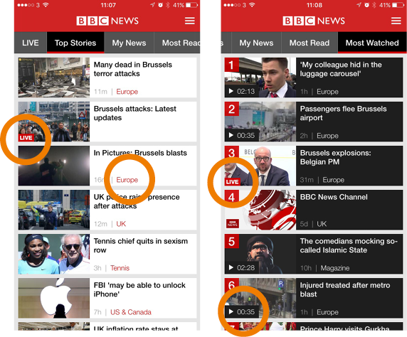
Ryan O’Connor, UX Creative Director, BBC News
Building the BBC news app
(most used app – just behind clash of clans on itunes)
Lessons from relaunching the news app
After five years the BBC app was redesigned an relaunched. Some of the things taken into account:


Design sprints
Understand • Ideate • Converge • Prototype • Test
-> Every week/Each and everything the teams are working on.
Navigation issues – Very challenging as there are lots of topics.
Using Google + for research and beta testing – even cheap methods with paper yield results.
Feedback analysis to know what you have to tackle.
Changing behaviour
- mobile phone not just for ‘on the go’ anymore
- becoming a primary screen, especially for millennials
- video use is more common (portrait video rising)
- people used to dipping in and out of phones consuming content many times throughout the day
- traditional traffic times changing
- what does this mean for our product?

Future
- simplifying navigation
- world service app (multinational + 7 more languages)
- Project “Newstream” this summer
Project “Newstream”
- Mobile video huge focus for industry. New apps and features like Snap Chat Discover, Periscope, Twitter Moments, Facebook video-views increase.
- BBC News looking at how we can better produce mobile video across our output (kids aren’t watching the 10 o’clock news on TV)
- A dynamic way of experiencing video news on the App
- Coming soon…
Recap
- Keep it simple: reducing complexity down to core features, avoiding late add-ons
- Minimising template variations that might eventually make it tough to maintain/iterate
- App vs Responsive: what are the core strengths, differences and audience expectations in your two products
- Audience: who are you over indexing on, who are you trying to bring in, balancing potential different needs and interests
- Mobile market continues to change dramatically from how people originally used Apps. How does this effect you?
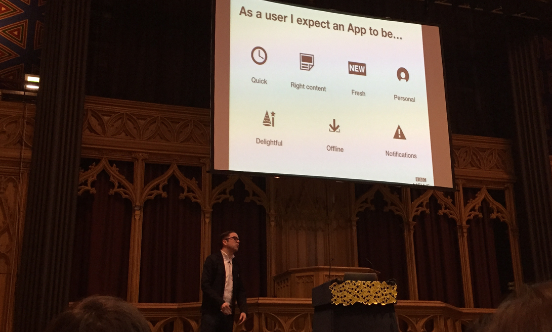
* Global experience language app standards (http://www.bbc.co.uk/gel) BBC are building a Global Experience Language for the BBC’s digital services.The GEL guidelines are a reference point for designing BBC services across Web, Mobile, iPTV and Tablet.
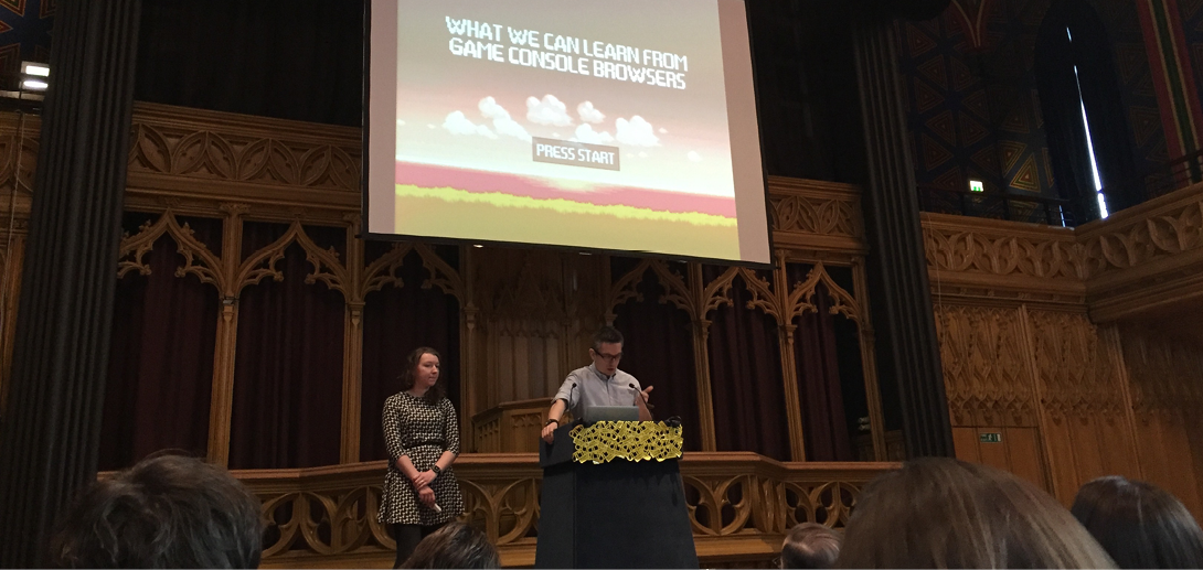
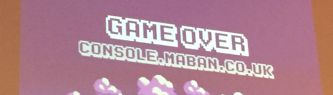
Anna Debenham
Game Console Browsers
Universal design!
…when all users’ needs are taken into consideration in the initial design process, the result is a product that can be used by the broadest spectrum of users.
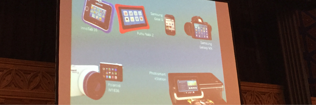
Companies will put a browser anywhere you can stick a screen. This means that when we design a website – we should take into account that users might browse it on something other than the normal mobile/tablet/desktop. On a console you can select “pretend you’re a phone” and then the mobile version is shown on screen.
vimeo has “couch mode” – they don’t guess what you’re browsing on – they give you the option
“Don’t make wrong assumptions – give people the option”
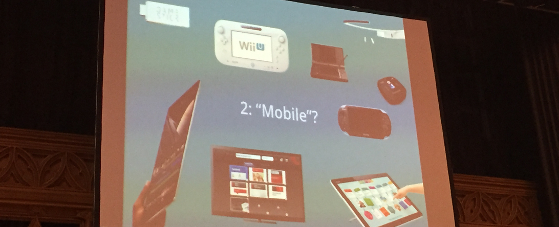
The devices that we use are converging. The lines are blurring between what is mobile, tablet and desktop these days.
People have started to complete Student Loan Applications using a Nintendo DS. Not all households can afford a console and computer so some teenagers use their consoles for web browsing.

Google’s 10ft Environment Design Guidelines
- Use a mobile phone as the model for the UI
- Leave vertical space for content
- Provide visual feedback
- Add more blank space between elements

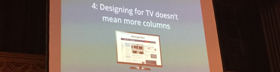
Universal design
=
Design for mobiles
Designing for desktop
Designing for the iPhone
Designing for consoles
Designing for the web
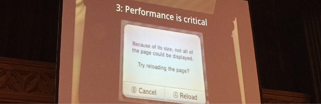
When designing a website you don’t take into account that people browse on consoles, hence lots of zoom options -> the texts are very small.
How some consoles are handling this problem:
Nintendo Wii U Internet Browser
Xbox Smartgall – mobile app to control Xbox1 with iPhone
Xbox snap mode – dividing page so you can play and browse at the same time.
NEXT -> virtual kits – no guidelines yet.