
I was lucky enough to attend DIBI conference for the second time this year, it’s definitely one of the best places to get inspired. This time the venue was The Royal Institution in London, a place with a rich history of discovery, the perfect location for Design It; Build It : London.
If you’ve never been to DIBI, the conference is divided into two main themes:
DI – stands for Design it – here the main topics revolved around Design, UX, Webdesign.
BI – which stands for Build it – Lots of good information about programming trends, do’s and don’t etc.
First, a brief overview of my general impressions:
- Presentations are high quality and the subjects interesting
- International speakers who know their stuff
- Venue had a wonderful atmosphere and it was well organized
I loved attending this conference and hopefully will be able to attend the next one in Edinburgh 30th-31st March 2017. I took a lot of notes and below have prepared a detailed summary of each of the speakers:

Tobias van Schneider
Side Projects are Stupid
Tobias is a German award-winning designer raised in Austria & currently living in New York City. He’s worked with Red Bull, BMW, Google, Wacom, Sony, Toyota, Ralph Lauren, Bwin & more. He’s the founder of Semplice which is a portfolio system based on WordPress for designers. He’s was also the Lead Product Designer & Art Director at Spotify.
Tobias van Schneider was to talk first and the theme was: Side projects are stupid. I knew that this was probably not exactly what he was going to talk about, I’ve been reading Tobias’s Blog for months now and know that his life is made up of side projects.
But still I felt a little pang… how could this be? My reason for living – stupid? Even though, professionally, I do what I love – I still feel the need to have at least a few side projects to keep myself occupied.
And I even need to read several books at once so if I get bored of one I can jump to the next- and it’s actually funny I thought of this “book” example because that’s exactly the same thing Tobias mentioned.
My train of thought was suddenly stopped…
Side Projects are stupid…
…because they have to be. (phew!)
People have a lot of ideas but come up with excuses not to work on these side projects. Or they get intimidated by questions like – How will this make me money?
-How can this be scaled up?
-What if I fail?
But side projects should be fun and stupid. Tobias’s side projects are things he makes for fun, or just for himself – but suddenly people want to start using them. Like ‘Authentic weather‘:
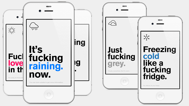
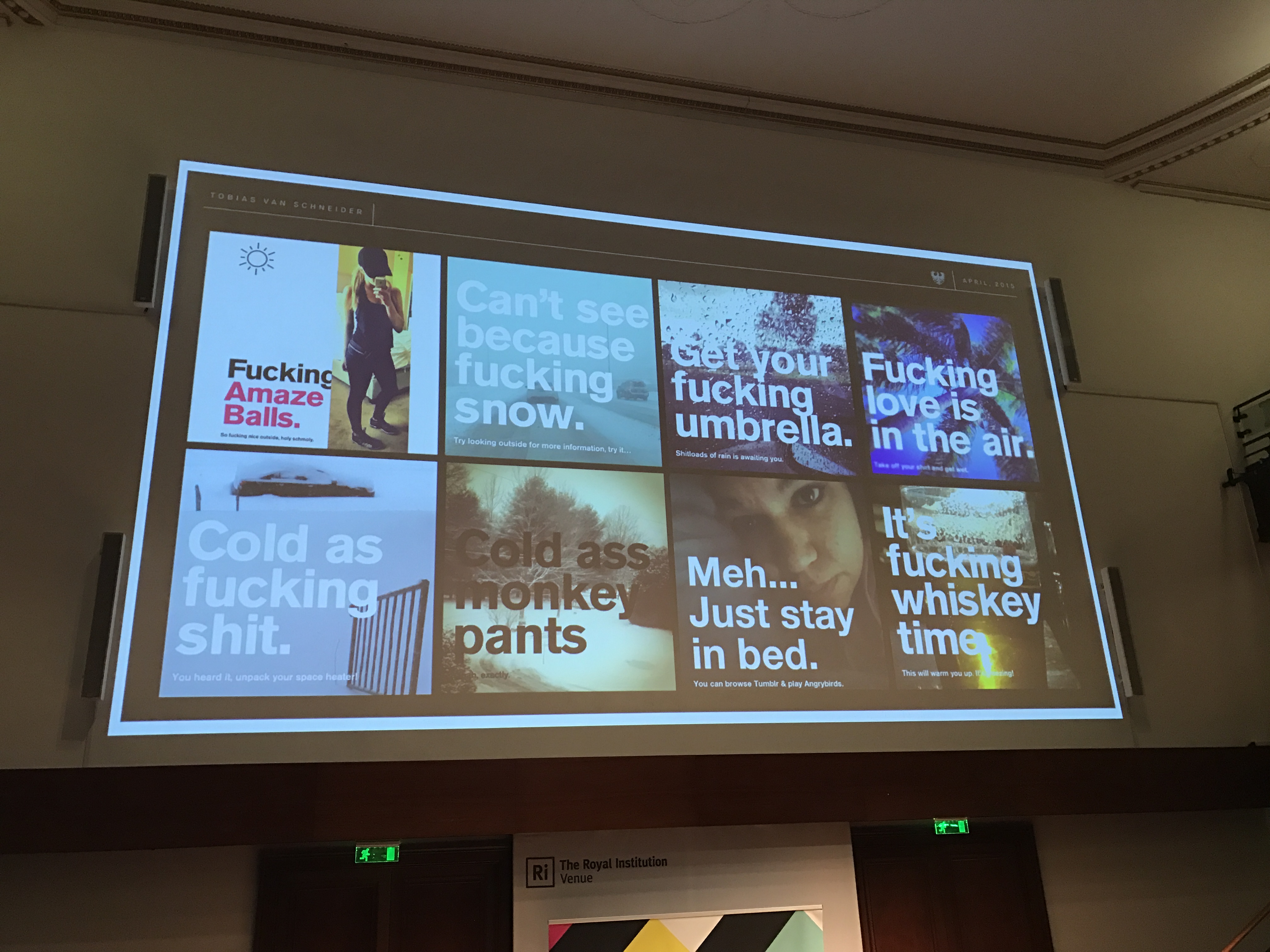
Authentic Weather is an honest weather app. Use the camera mode (swipe right) to snap a picture of the weather and share it with your friends
Why Tobias has Side projects:
- Motivation to learn something new.
If you don’t have a project with a specific program you have to learn – it’s hard to learn it just like that.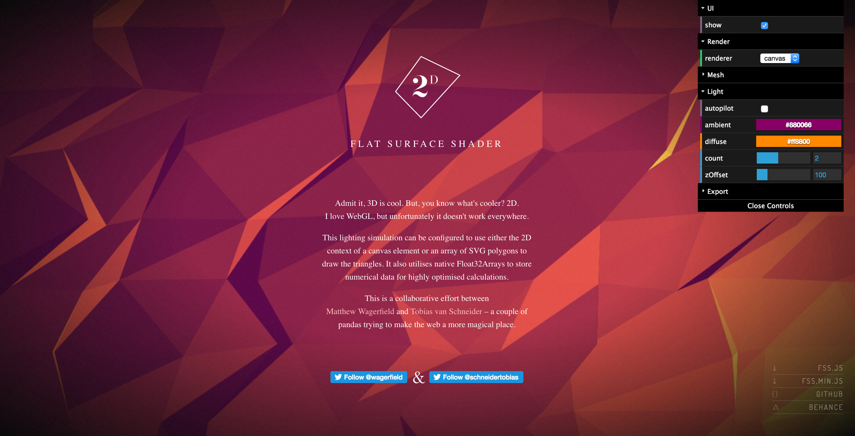
Flat surface shader - Make something useful
Semplice – portfolio toolSemplice is a portfolio tool created by Tobias and a friend. At first, he did it only work himself – but he thought it such a good tool that he made it available for other designers to use. Made with no business model. - Make people laugh
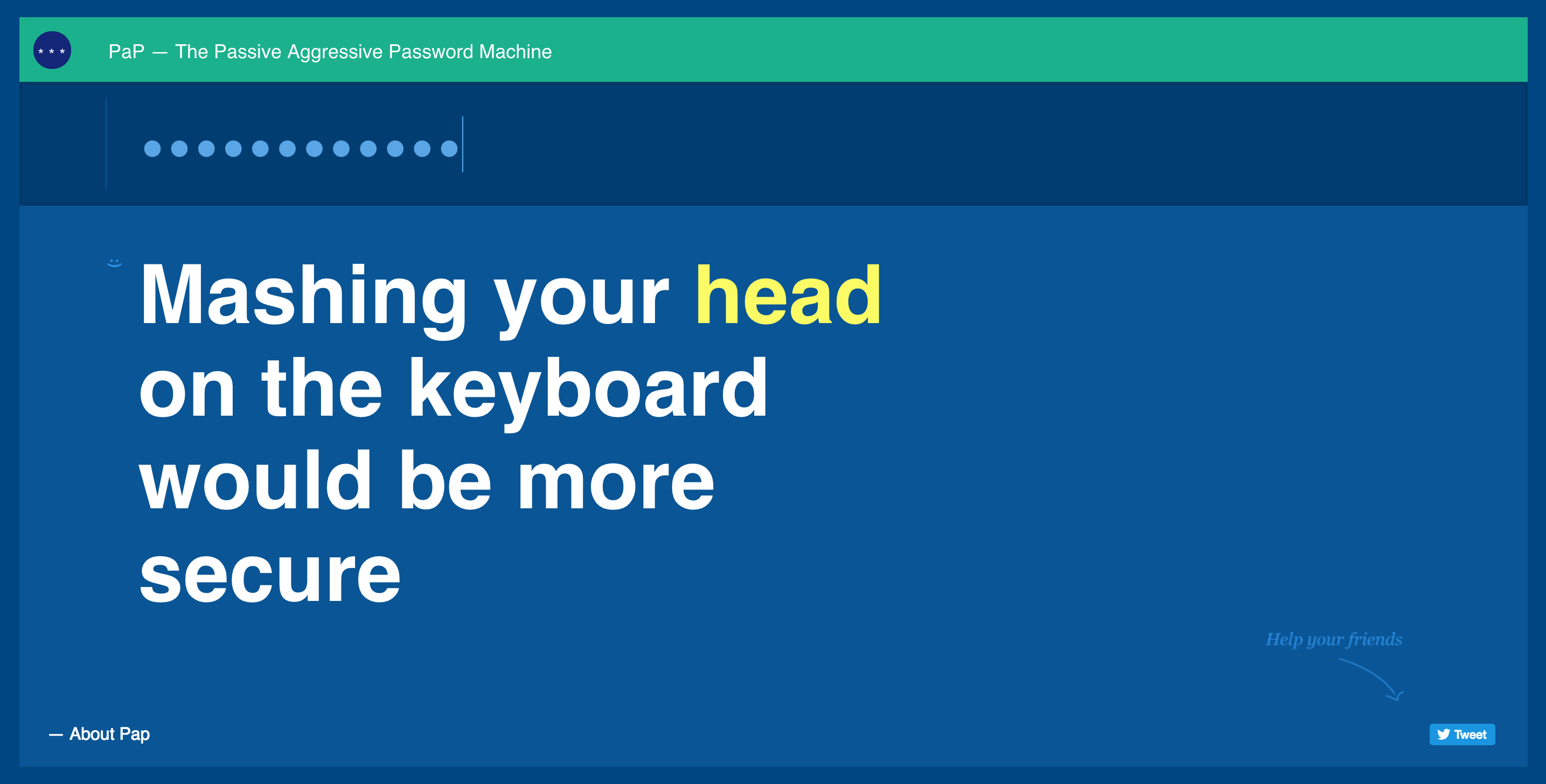
The Passive Aggressive Password Machine
“The best way to complain is to make something!
James Murphy
His 5 principles:
- Let yourself be stupid

The ‘Kiss’ principle
- Ignore everybody – Everyone is against you. The more original your idea the less good things people have to say. Ideas get killed in brainstorming sessions. Try to ignore what people say in the first phase.
“If 10 people call you stupid or an idiot, you got your validation, now prove them wrong”
- Trust your gut. Big data says a lot. Big companies test everything but in new projects – data can be misleading.
Intuition
Instinct
Life Experiences= Gut Feeling
- Be a jack of all trades (doesn’t mean you’ll be a master of none)… maybe a master of some? It broadens your horizons and allows you to be flexible. Diversity is strength.

You can’t focus on one specialty – the world is moving too quickly. - Stay busy. Tobias claims to be lazy but loves to work hard. Start reading 5 books at the same time. That way when you get stuck on one, you can procrastinate with another. And do the same with side projects.
“Keep it stupid & keep creating.”

Josh Payton
Missed Connections
Josh’s talk used an example of bad UX and design (United airlines) to illustrate what is needed to drive good design:
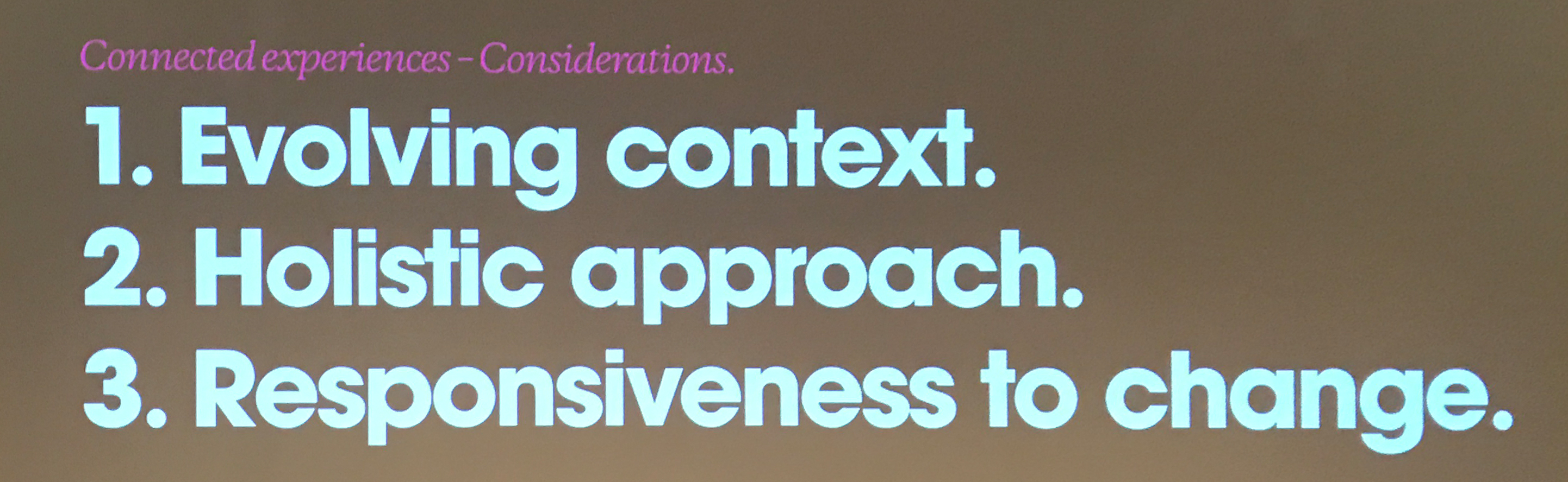
- Context
- Approach
- Change

Here’s one part of the problem: At an airport bar, airport touch screens have been installed to ease airport stress, but they really just ruin a perfectly good social experience. They’re expensive, obsolete and force the people working at the bar to become tech support .
Why does this universally suck? Because the people who put this in place don’t put the user experience first. They see something new (iPads) and jump on the chance to look modern – but by the time they’re installed they’re already obsolete. They haven’t looked at the context – just jumped straight to the approach.
Companies want “Digital Transformation”, but don’t really know what it is and what it’s for. It’s a bit like playing a game of whack-a-mole: a company might develop an apple watch app because it’s the ‘new thing’ that pops up without having any data about how many people actually have apple watches – so it doesn’t succeed. And then another new bit of technology pops up and the trend continues.
But according to Josh, this is the age of the cyborg:
“cyborg: a person whose physiological functioning is aided by or dependent upon a mechanical or electronic device. We use technology to schedule our lives, to track our heart rates, our exercise, our diet and so on…”
The system is the product and either people buy into it because it is seamless and integrates with the rest of their ‘cyborg’ lives or it doesn’t and you get bad design.
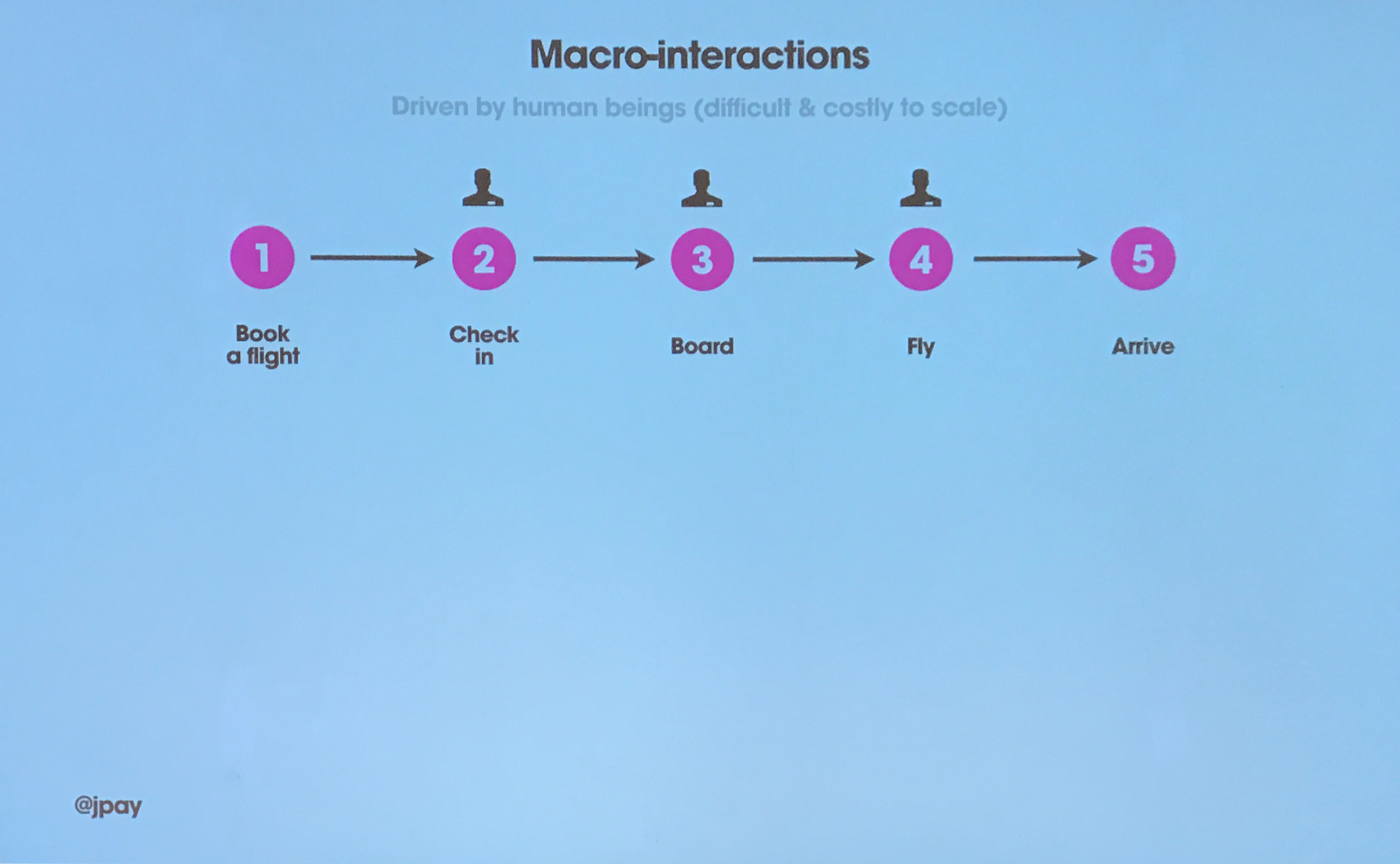
Back to the United airlines example, this is how the user journey looks to the airline:
But really, it looks like this – and this is the problem:
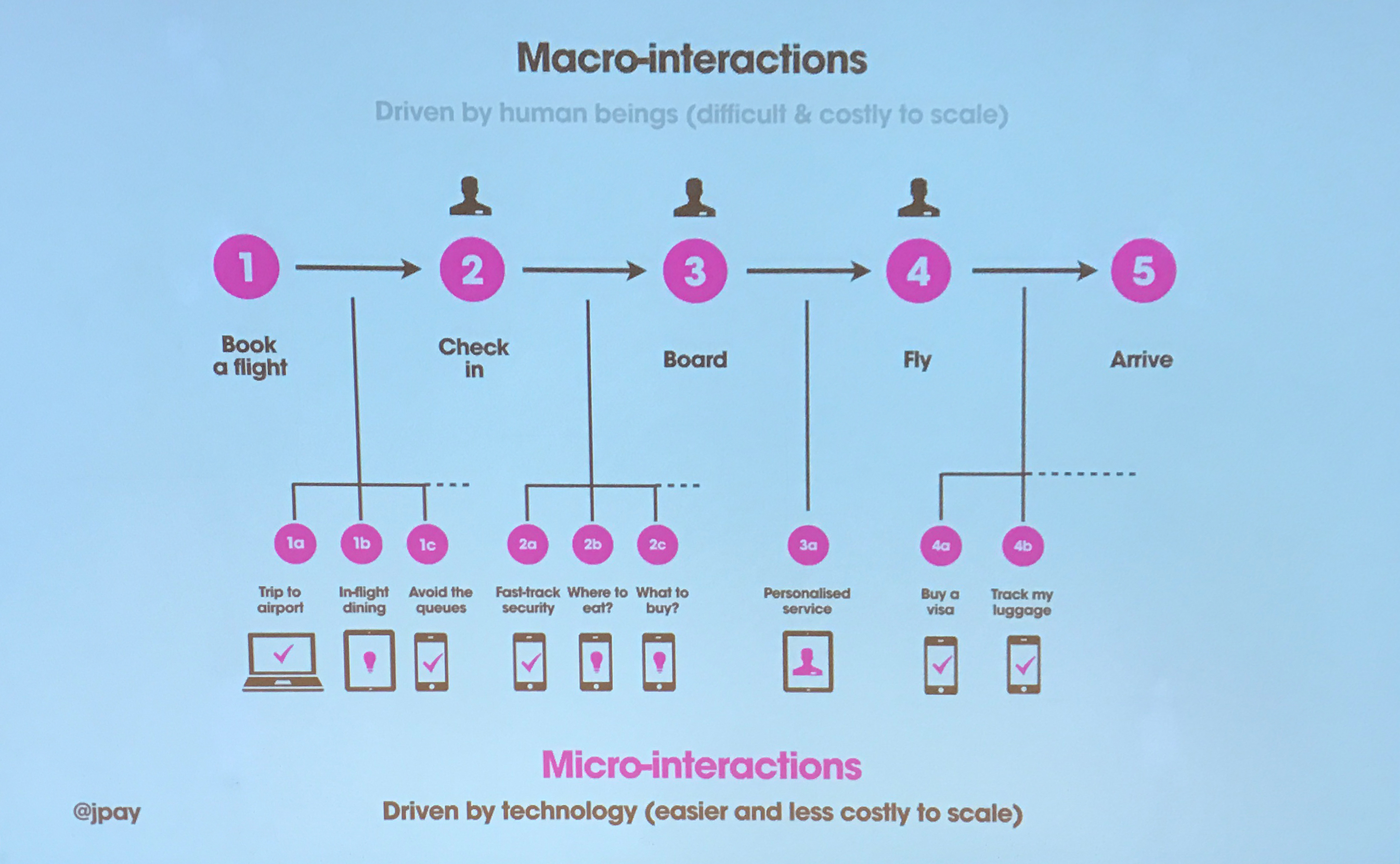
If each of these micro-interactions isn’t a seamless part of the system the customer will become frustrated. Part of the problem stems from the fact that the people making the decisions for this also manage the rest of the workings of the airport – like making sure the planes are refueled, managing the cargo and so on.
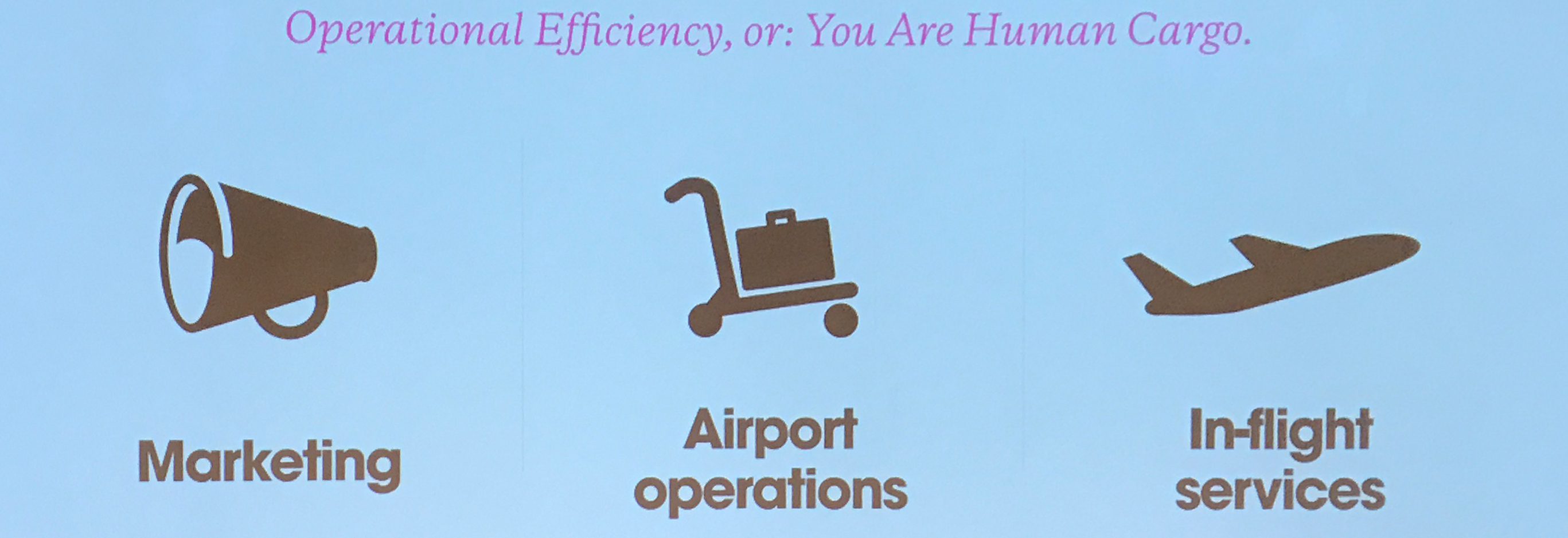
Dig deeper into the United airlines site and you end up with this frustrating bit of bad design:
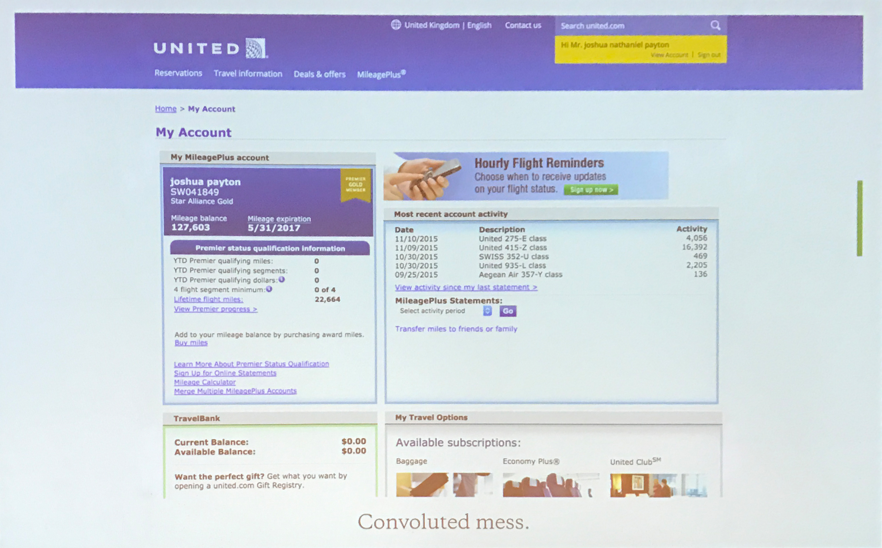
It’s just a broken experience.
So how can we fix it? With a systemic approach.
Businesses tend to look at the ‘business’… how to make the ‘guys in the suits’ happy.
But you have to humanize your product and think of the user experience. When building a product, this should be the order of importance:
People
Problem
Product
Profit
Let’s look at a good example of this: Apple

Apple have created a system where people naturally gravitate to their devices. They have built a great, customizable system that you can upgrade and which is highly compatible. The first word you see on the packaging is “designed”. Apple is a design culture.
“The forest before the trees”
“If we have a system of improvement that’s directed at improving the parts taken seperately, you can be absolutely sure that the performance of the whole will not be improved”
Russell L. Ackoff
And here’s a project Josh worked on for Southwest trains, an example of a good customer journey that puts people first:
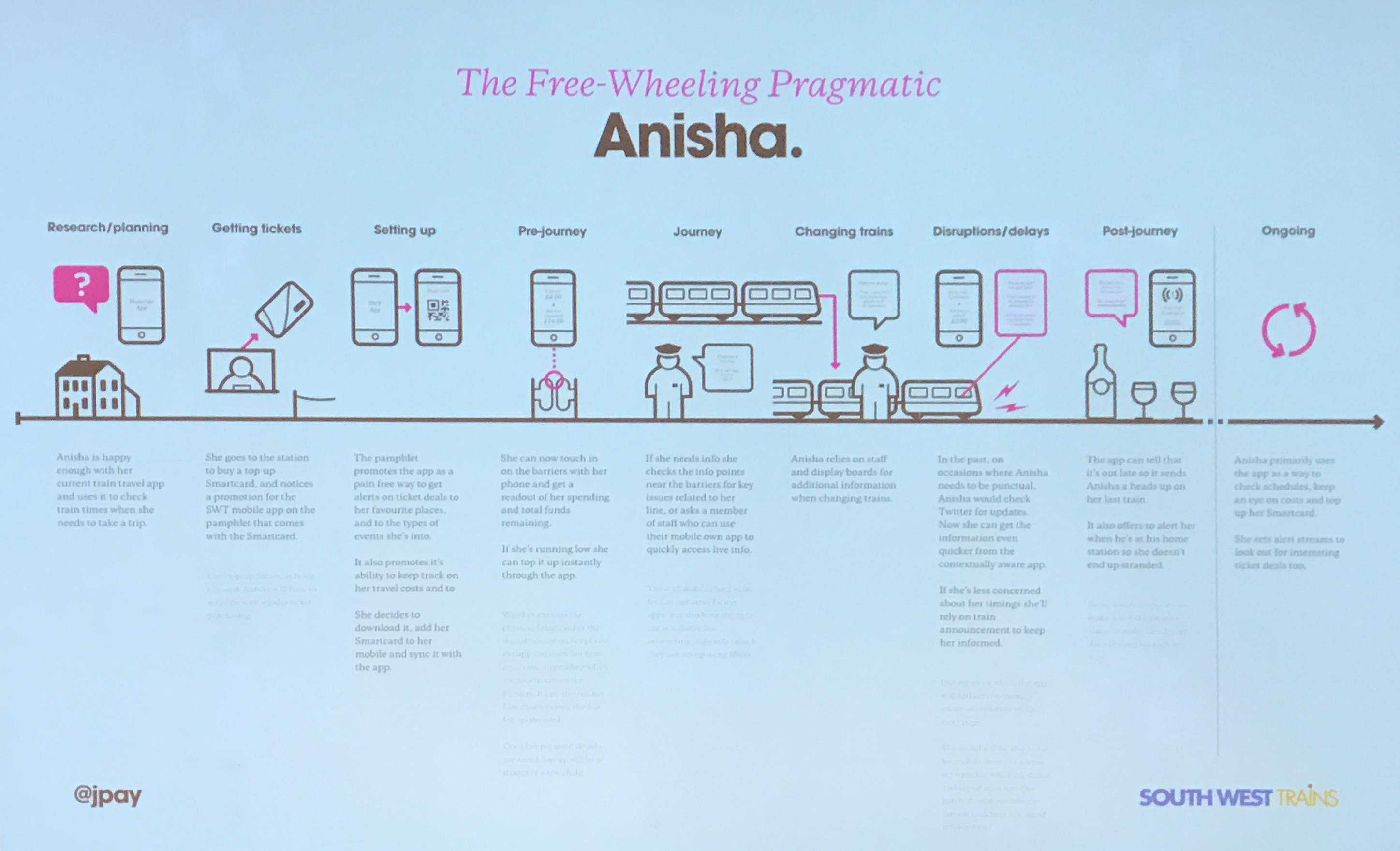
When designing the new website they sat down and had a think about exactly what the commuters go through every day.
Organizations are blind. They try to create lateral efficiency. But as designers, we shouldn’t concentrate on just how the button works.
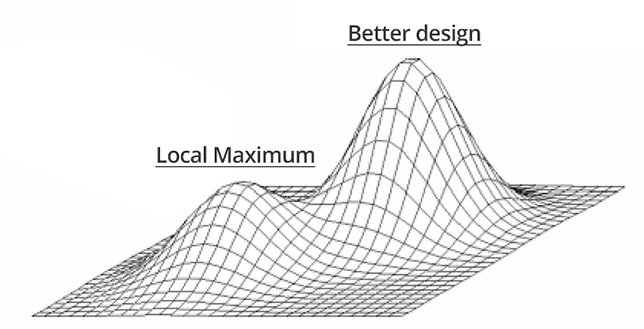
The local Maximum occurs frequently when UX practitioners rely too much on a/b testing or other testing approaches to make improvements. Interesting article about this here
Beware of the tragedy of the commons. This is a situation within a shared resource system where individual users acting independently and rationally according to their own self-interest behave contrary to the common good of all users by depleting the shared resource… Like cows being left to graze in a field without limits.
“Progress isn’t made by early risers. It’s made by lazy men trying to find easier ways to do something.”
Robert A. Heinlein
Systemic change
Everything is changing. How do we deal with it? – Embrace it!
Three things needed for successful organizational change:
- Emotional commitment from the top
- Organizational readiness
- A burning bridge
“What can I do?”
Nothing. If Design isn’t a priority where you work – quit your job.
“Continuous improvement isn’t nearly as important as discontinuous improvement.”
Russ Ackoff
You become a leader by leapfrogging and doing something amazing.
Evolution – keep pushing forwards
“It is not the strongest of the species that survives, nor the most intelligent, but the one most responsive to change”
Charles Darwin
Be responsive to change. Embrace it, pay attention and be optimistic. Look at the landscape and ask yourself what are you doing and why.

Frances Berriman
Designing with red tape
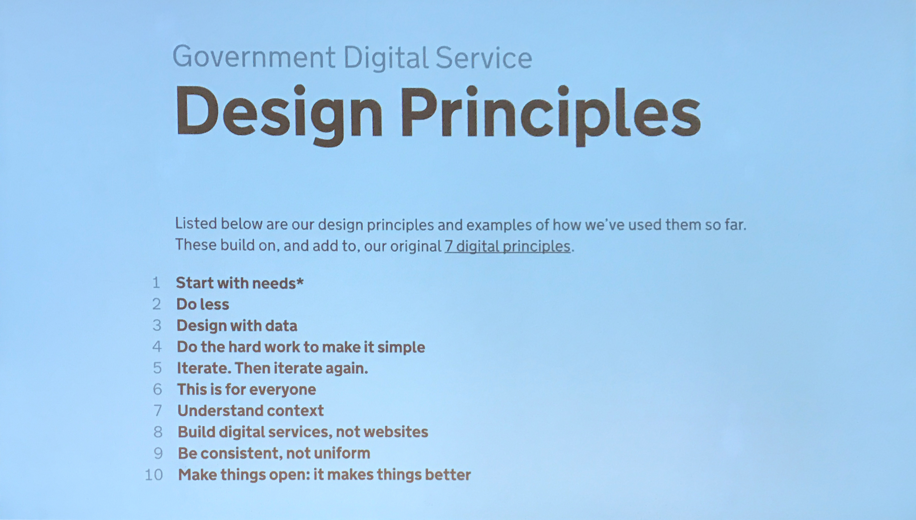
Frances worked on the gov.uk website. Her team had the task of combining 2000 websites into 1. To make it simpler, easier, faster and cheaper to run.
So how did they do it?
It all comes down to culture change rather than changing all the people. Companies don’t know how to use creative people. It’s usually not a case of people getting better, but changing the way they work and getting that locked up creativity out. But culture change is hard.
1.
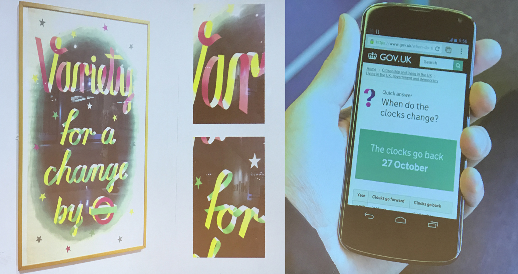
Share user experience – it tends to be siloed with the design team. UX is part of everyone’s job and people should be pushed into it. UX is not just the design. A good example – being able to use digital signatures and fill out forms online instead of going to the council to give a signature required a policy change – so in this case, even the policy makers got involved in UX.
Troubling user experiences:
- Unclear call to action
- Confusing navigation
- Improper or confusing language
- Poorly worded error messages
- Slow server response time
- Data-eating images
- Verification and security requirements
2.
Stay Honest (and be ruthless)
At some point, the team decided to create lovely “ribbon” icons to put onto the website. They were used everywhere. After a couple of months, they asked a few users what they thought about the icons – most didn’t even notice them. The ones that did just didn’t care. Users don’t care about icons – they go onto the gov website to do boring things. They just want to quickly find what they’re looking for and leave.
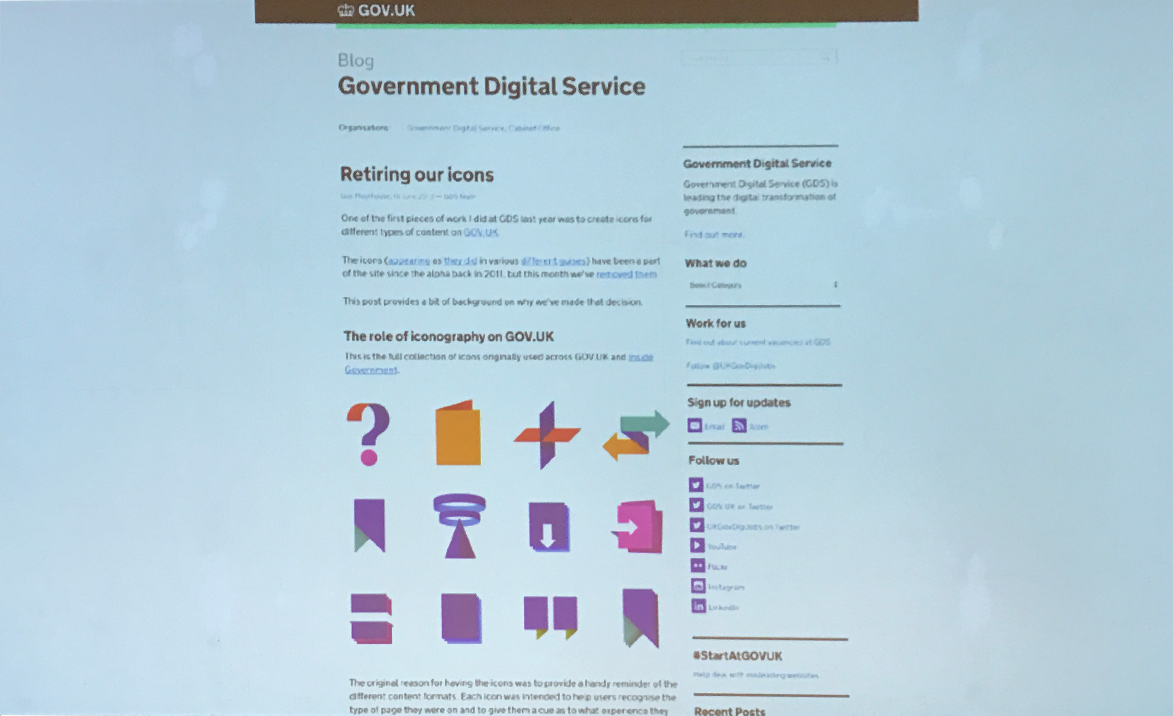
So, the icons were “retired”
3.
Research as a Team Sport
Everyone should understand how the website works and how the users use it. Remember to fight against these common excuses for not doing research:
- It’s useless – we already know how people use it…
- Expensive – No time, no equipment, no people
- Fear – We might not like what they have to say
Frances’s team organized a training session for the company workers to show them what user testing is about. It’s not expensive or scary. Try to create a culture of tiny observations – ask people questions and watch them use the thing you’ve built.
4.
Play in the same field. Designers are usually separated from the other teams. But everyone should work together. Designers sitting with coders helps them to know what others are doing. “Hidden waterfalls” happen less when you work together.
“Good services are verbs
Bad devices are nouns”
Design principles:
5.
Share and celebrate.
Keep people in the loop and find time to celebrate. Try doing show & tell sessions once a week. Try and get as many people to take part and if you have to, organize them right next to the desk of people who usually can’t make the sessions. And always show work in progress.
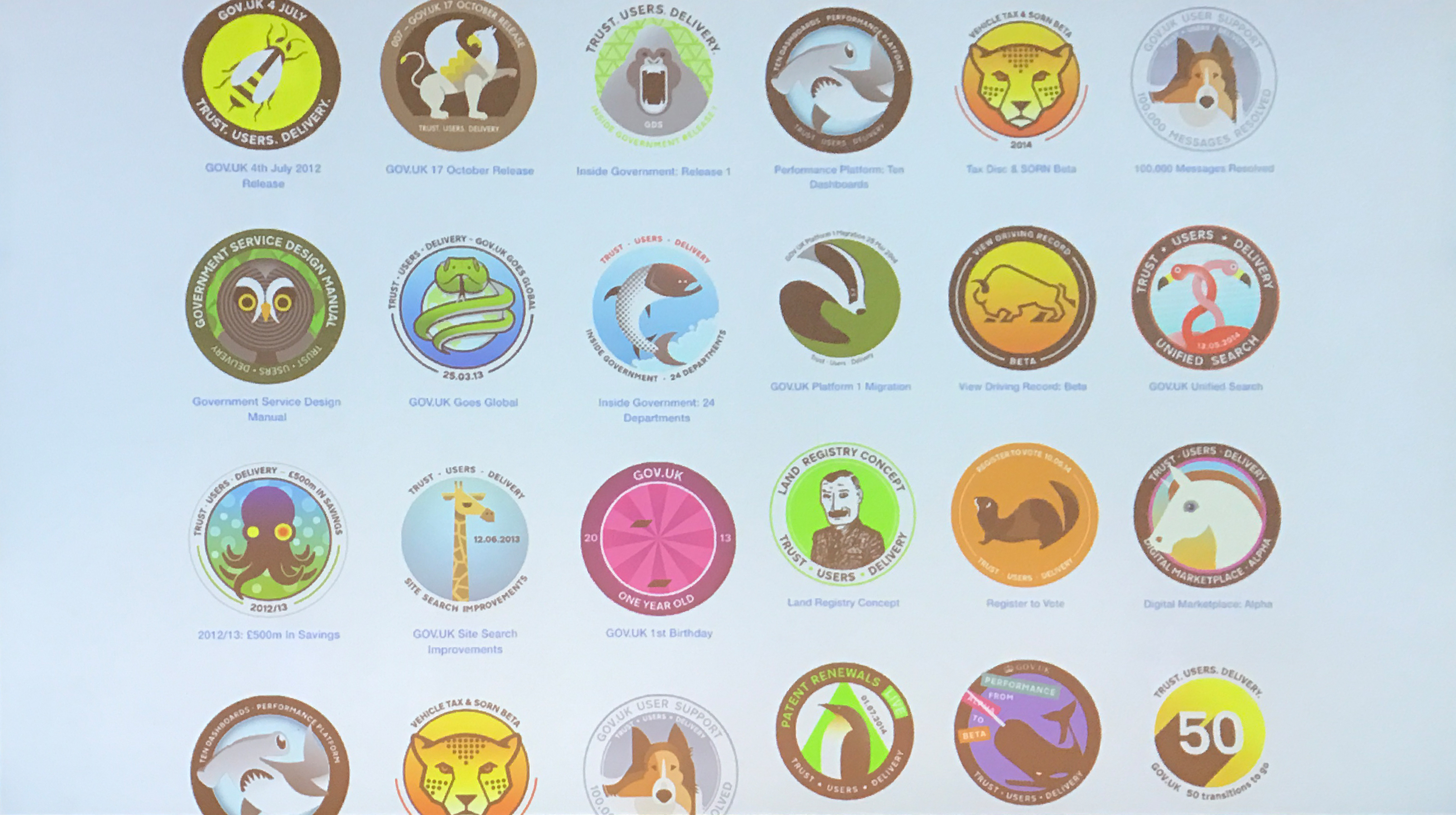
Create stickers to celebrate reaching a goal. It helps people feel part of the team.

Jane Austin
Designing the design team
Jane’s talk focused on good management practices. She drew examples from history and modern day to illustrate her points.
Ford Production Lines – The company didn’t invest in workers and people were really unhappy, stuck doing the same thing day in and out. And if they found a fault it was almost impossible for them to stop the production line and do something about it.
While in Japan companies started investing in the workers. They were encouraged to stop the production line, and anyone could do it – even the lowest paid worker. This was the beginning of Quality Control.
Shitty management is passive aggressive and controlling, but it was the accepted way of doing things. Until Agile arrived, and changed the way people manage and work. People started talking and collaborating on the same level.
“If you wish to build a ship, do not divide the men into teams and send them to the forest to cut wood, rather teach them to long for the vast and endless sea”
via @cennydd
As a manager, your number 1 job is to create an environment where people can do their job well and by themselves.
“The leader who gives up control gains more power and influence than the one who keeps it”
David Marquet
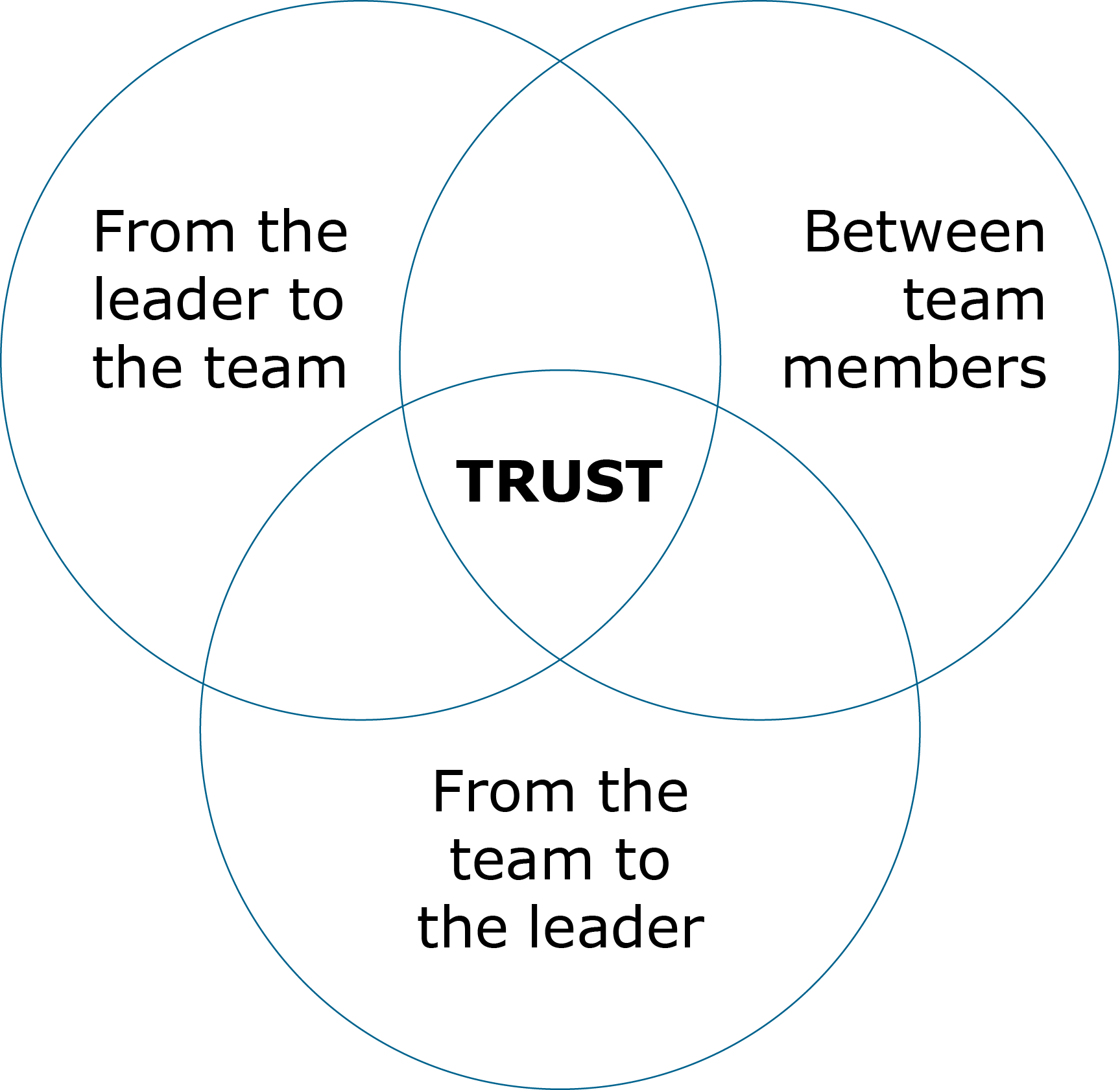
Trust
Empower as much as you possibly can. People should make the decisions by themselves. You can frame the problem and get people to be passionate about the project. Trust people to self-manage how and when they work. Let people decide what to do and you just confirm their thinking.
Don’t micromanage – use “Risk and Reward” so that you don’t kill enthusiasm.
“All good work is done in defiance of management”
@raffi
The antidote to fear is trust. You have to invest the time to get trust between team members. Trust the process you use.
Trust is the most important thing in team management

Peter Parkes
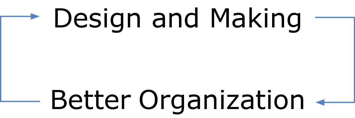
The journey from software to hardware
Peter works for a Software company. A couple of years ago they decided to extend their capabilities to hardware. He knew you can’t ‘do change by powerpoint’. Change in theory, wasn’t enough. So they decided to test themselves and came up with Hackaball.

Hackaball encourages kids to learn about technology, play together and be physically active. The iPad and iPhone apps make it easy to program the ball and respond by changing colour and light patterns by vibrating and playing different sounds.
Why add this new capability?
- New opportunities
- Process changes
- Evolve/broaden capabilities to be ready for anything a company throws at them.
What did they learn?
- Prototyping is slower than in software development.
- Feedback loops are way longer
- Physical products are hackable
- Manufacturing isn’t too difficult
- Firmware is difficult – slow processes are very frustrating.
- Selling stuff is easy (thanks to crowdfunding)
- Different levels of intensity than in software development
- New skills are required
- Dependencies on 3rd parties – something that you have to manage. With Software you try to do everything alone. With Hardware you have to learn to work with and manage other companies.
- You use a lot of your free time.
- You spend a lot of time on design, research and user testing.

Dan Cork
Unify The UI with React
Holiday Extras needed some back-end work. They looked into the code and found hundreds of lines of overwritten css code. Css is so forgiving – you can overwrite earlier css and that means that after time the code becomes very messy with lots of useless code clogging up the site. They put their code through cssstats.com – and were humbled by the amount of mistakes they had.
They decided to rewrite the whole website and looked into what frameworks to use. The first thought was Bootstrap – but decided against it. Bootstrap is great for prototyping, but not so great for a live site. The main problem is every site ends up looking exactly the same as all the other Bootstrap sites. Bootstrap has constraints when it comes to personalisation. It is configurable but this can cause bloat. And grids are just old news. It just won’t make you stand out.
Why use React?
React (sometimes styled React.js or ReactJS) is an open-source JavaScript library providing a view for data rendered as HTML. React views are typically rendered using components that contain additional components specified as custom HTML tags. React promises programmers a model in which subcomponents cannot directly affect enclosing components (“data flows down”); efficient updating of the HTML document when data changes; and a clean separation between components on a modern single-page application. It is maintained by Facebook, Instagram and a community of individual developers and corporations. According to JavaScript analytics service Libscore, React is currently being used on the websites of Netflix, Imgur, Bleacher Report, Feedly, Airbnb, SeatGeek, HelloSign, and others. As of March 2016, React and React Native are Facebook’s top two open-source projects by number of stars on GitHub, and React is the 6th most starred project of all time on GitHub.
- Makes writing Javascript easier – React uses a special syntax called JSX, which allows you to mix HTML with JavaScript. This is not a requirement – you can still write in plain JavaScript. You can just drop a bit of HTML in your render function without having to concatenate strings. React turns those bits of HTML into functions with a special JSXTransformer.
-
Components are the future of web development – Shadow DOM and frameworks such as PolymerJS generated a lot of buzz lately, and rightly so. The core concept of Polymer boils down to creating self-contained, customizable elements that you can easily import and use in your project. This in itself is a fantastic idea, but React takes that concept to the next level. React doesn’t use Shadow DOM – instead, it gives you the ability to create your own components that you can later reuse, combine, and nest to your heart’s content. It’s easy to define and manipulate your own components.
-
Extremely efficient – It creates its own virtual DOM where your components actually live. This approach gives you enormous flexibility and amazing gains in performance because React calculates what changes need to be made in the DOM beforehand and updates the DOM tree accordingly. This way, React avoids costly DOM operations and makes updates in a very efficient manner.
-
Awesome for SEO – You can run React on the server, and the virtual DOM will be rendered and returned to the browser as a regular web page.
-
Out-of-the-box developer tools – After installing React Chrome extension, you’ll have a direct look into the virtual DOM just as if you were browsing a regular DOM tree in the elements panel.
-
Developed by Facebook – React is now open source, but it was first developed at Facebook for internal purposes. After a while, Facebook engineers realized that they created something truly awesome and decided to share their project with the world. Facebook uses some React, and Instagram’s entire website was built on React after the two companies joined forces. Other successful projects using React include Khan Academy and New York Times.
-
Building mobile apps using React Native – Though it is not directly related to React, React Native follows same design patterns, making the transition easier

Marco Cedaro
Zombie Code
How to identify Zombie Code?
1.
It smells
Tip #1 – Code should be appealing
- It shouldn’t be hard to read
- You should not use a lot of ‘ifs’
- Don’t use loads of function events
- No to deep level of indentation
- Don’t leave lots of comments explaining how to read the code.
Tip #2 – Code should talk to you – Don’t use comments to explain bad code.
Tip #3 – Code should have personal boundaries.
Code-Sense is the key
“Writing clean code requires the disciplined use of a myriad little techniques applied through a painstakingly acquired sense of “cleanliness”.
Robert C. Martin
Worst case smell
- Long methods
- Deep level of Indentation
- Hard to tell what it does
- Lack of portability
- Copy/paste driven development
- Callback hell
2.
Quarantine
Most teams are trying to stop further spread only through quarantines. It’s a good short-term solution, but it won’t prevent long-term population loss.
In 1969, Philip Zimbardo, a Stanford psychologist, conducted an experiment. He parked a car without license plates and with its hood up on a street in the Bronx and another in Palo Alto, California.
The car in the Bronx was attacked within 10 minutes of being there. The car in Palo Alto, however, remained intact for a week. So, Zimbardo himself smashed a window. Soon, passersby, “primarily respectable whites”, joined in the destruction of the car.
Don’t leave “broken windows” (bad designs, wrong decisions, or poor code) unrepaired. Fix each one as soon as it is discovered.
“Programming is insanely detail oriented, and perhaps this is why: if you’re not on top of the details, the perception is that things are out of control, and it’s only a matter of time before your project spins out of control.”
Jeff Atwood
Isolate the zombies – define the code style guides and enforce them. Everyone in the team should be writing the code as if one person was writing it. Take care of the little things once and let go.
Test your code – make testing part of the process, do code reviews and involve people – even the ones that don’t write the code.
Design for your goal.
3.
Modular Architecture
Refers to the design of any system composed of separate components that can be connected together. The beauty of modular architecture is that you can replace or add any one component (module) without affecting the rest of the system. The opposite of a modular architecture is an integrated architecture, in which no clear divisions exist between components.

4.
Overengineering
“The key is to acknowledge from the start that you have no idea how this will grow. When you accept that you don’t know everything, you begin to design the system defensively.”
Nicholas Zakas
You are going to write Zombie Code anyway so embrace it…
Just remember to aim for the head!

Stefanie Posavec
Cold Data, Warm Heart
Data visualization is the presentation of data in a pictorial or graphical format. It enables decision makers to see analytics presented visually, so they can grasp difficult concepts or identify new patterns. Data visualization is nothing new.
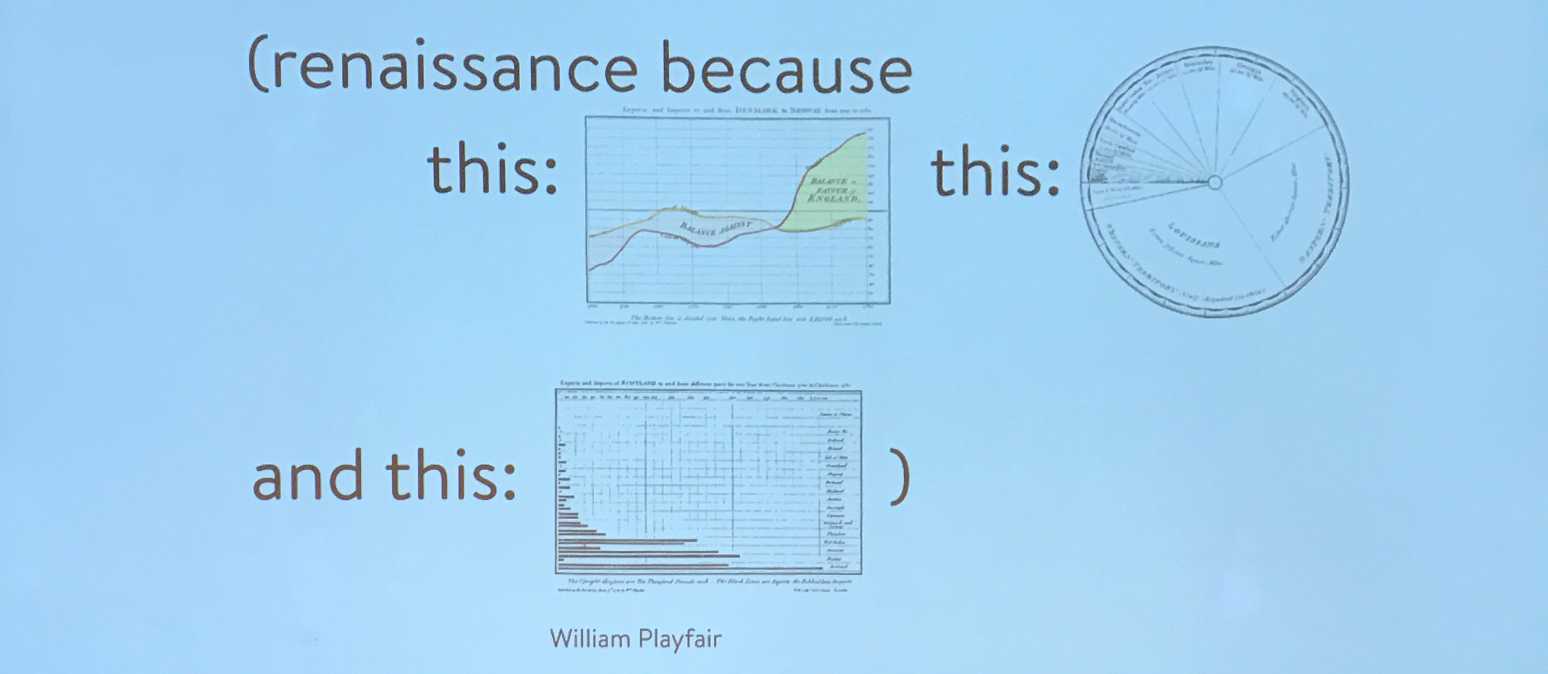
A few years ago we started a Data Visualisation Renaissance, using data and information as decoration. We’re actually in stage two now – looking at Data laterally.
paper, paint, clay, marble…
….data
It’s just a new material for designers to work with.
Data can be both a scientific and cultural material. Data Visualisation is a process.
Data as an honest design material. Maybe designers use data differently than a scientist, but we both have the same goal:
honesty + truth
What’s important when doing Data Visualisation:
- Uphold data integrity
- Show the ‘gist’
- Provide an explanation
- Use data that resonates
- Consider context
- Make it: Accessible, Memorable and Impactful.
Project #1
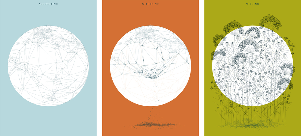
Memory Palace exhibition at the V&A. Mixing data with illustration to show the world
Mixing data with illustration to show the world Pre, during and post-apocalypse. Showing how a network connected world is destroyed and weeds grow out of the data debris.
Project #2
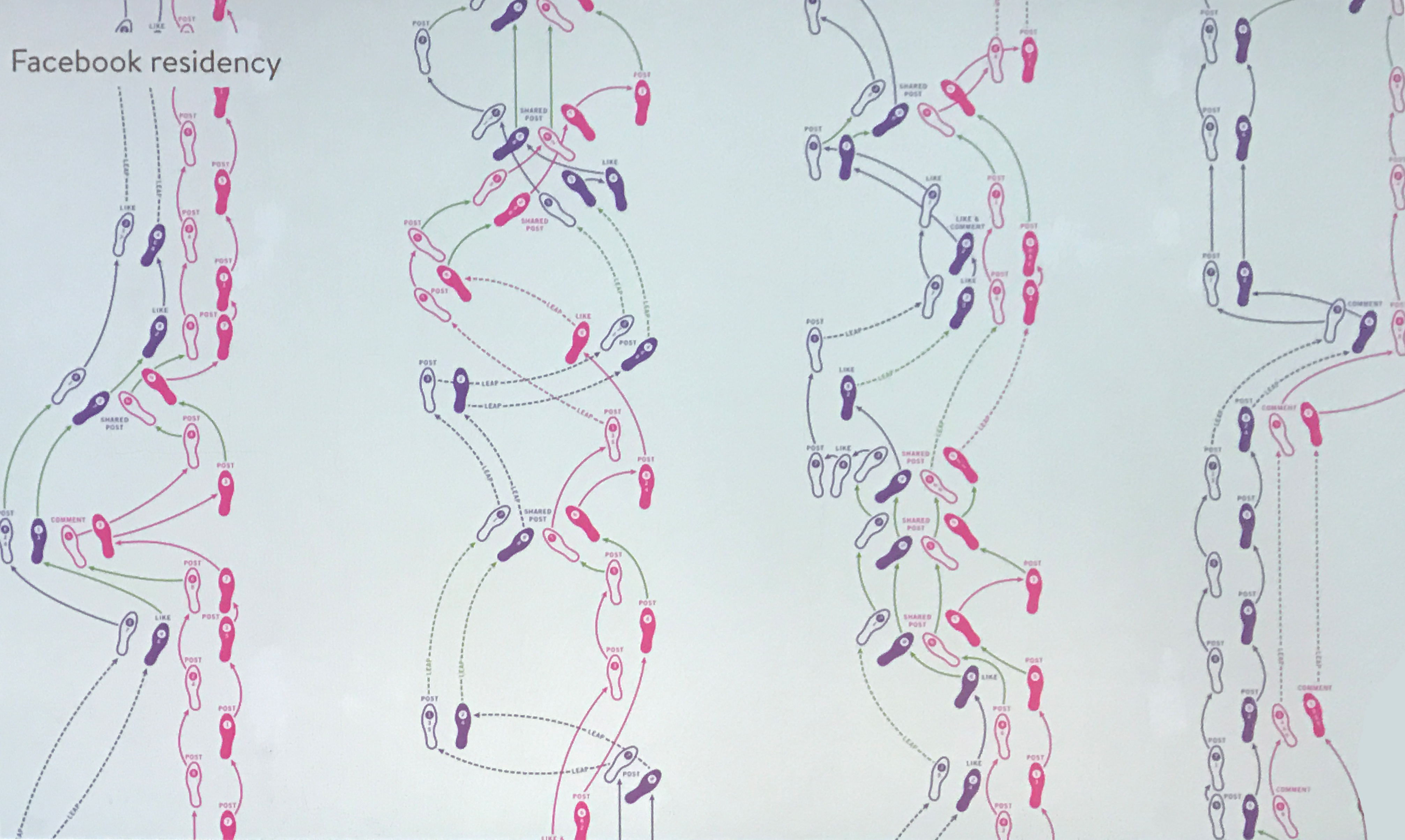
Using data to comment on our digital relationships. Stefanie spent a 7-week ‘data artist residency’ within Facebook’s Analog Research Lab in the summer of 2013 at Facebook’s headquarters in Menlo Park. Her task was to create artwork for the campus, so she decided to create two interactive pieces on the floor where she converted a month of a couple’s Facebook interaction data into dance steps, referencing how couples often ‘perform’ an orchestrated, public version of their relationship on social media. The dance steps are timed to an 8-step count, and by following the notation, passers-by can move through an accurate representation of a couple’s digital movements and interactions in the real world.
Project #3
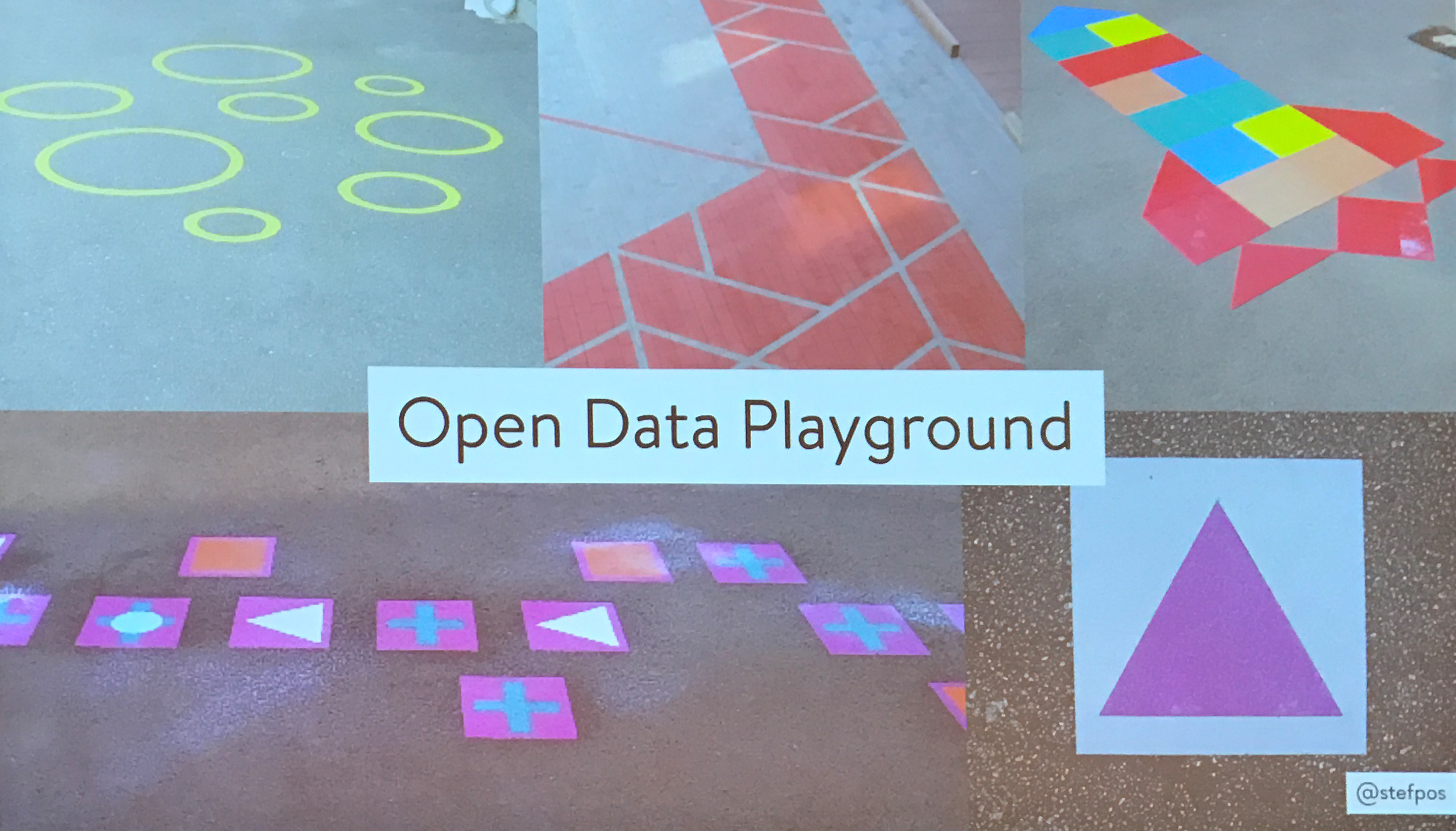
This project was commissioned as part of the Web We Want Festival at the Southbank Centre (London), where events and exhibitions were held to commemorate the 25-year anniversary of the Web. Stefanie was asked to create a piece to be placed in the Royal Festival Hall that would make the benefits of open data approachable and accessible to passers-by (both children and adults) who might not have much experience with data.
Open data is data that can be freely used, reused, and redistributed by anyone.
Project #4
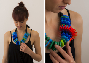
Air Transformed is a series of wearable data objects that communicate the physical burden of air pollution in different ways. Though seemingly decorative, they are based entirely on open air quality data from Sheffield, UK, a former steelmaking city and notorious for its bad air. Her task was to create friendly, accessible pieces that used open air quality data to inspire public engagement with the issue of air pollution.
What if we could see the air pollution?
What if we could feel the health burden on our bodies?


Project #5
Using data to communicate her personal life with the life of a friend.


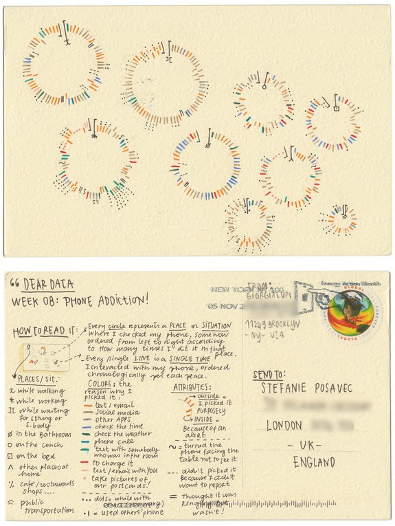
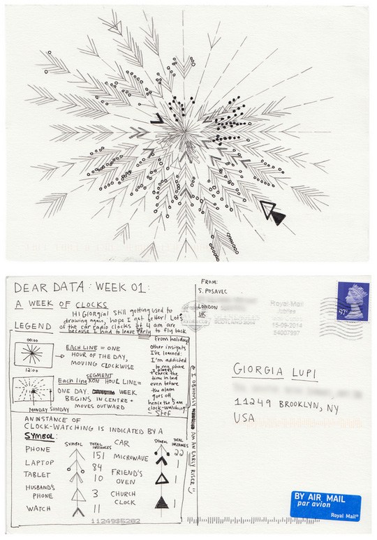
Dear Data is an extraordinary yearlong correspondence project that Stefanie did with Giorgia Lupi. Every week, they each selected one aspect of their daily lives — from their complaints to their spending habits to their use of mirrors — and itemized its components in a hand-drawn visualization on the back of a postcard, then mailed it to the other. They deliberately used different visual metaphors and visualization techniques for each week’s postcard.
Dear Data is:
delicate, refreshing, absorbing, natural, lovely, human, awesome, dedicated
Data is the beginning of a conversation.
All you need is a pencil!
I am a big fan of the DIBI conference and definitely recommend it to anyone who’s interested in Webdesign, UX, UI, Coding or just looking to be inspired. My colleagues and I came out with a head full of ideas. We will share all this insight with the rest of our team and hopefully be able to incorporate some of them. Particularly the ones about Design being a lot more important in the company then people tend to think and UX being everyone’s job.
My core message is: Make sure to take part in as many conferences as you can. They’re never a waste of time and even if the topic of the speaker is not exactly what you’re interested in – you will still hear a nice quote or learn something new that could be incorporated to your type of work. Spend time on things that matter – self-development is definitely one of them.
Dibi reading list:
Dear Data
by Giorgia Lupi and Stefanie Posavec (Flexibound)
Creativity, Inc.: Overcoming the Unseen Forces That Stand in the Way of True Inspiration
by Ed Catmull
Turn The Ship Around!: A True Story of Building Leaders by Breaking the Rules
by L. David Marquet
The Art of Problem Solving: Accompanied by Ackoff’s Fables: Accompanied by Ackoff’s Fables
by Russell L. Ackoff
A Technique for Producing Ideas (Thinking Classics)
by James Webb Young, Robbie McCallum
Don’t Make Me Think
by Steve Krug
Atomic Design (blog at the moment)
by Brad Frost
Co-written with Anna Marinou


